It’s been a quiet month here at the Jim Witkowski Photography World Headquarters in the greater Congress Metropolitan Area, but we’ve been busily slaving away in the basement revising the web site. I thought I’d stop for a moment, get a cup of coffee and point out some of the changes we’re making.
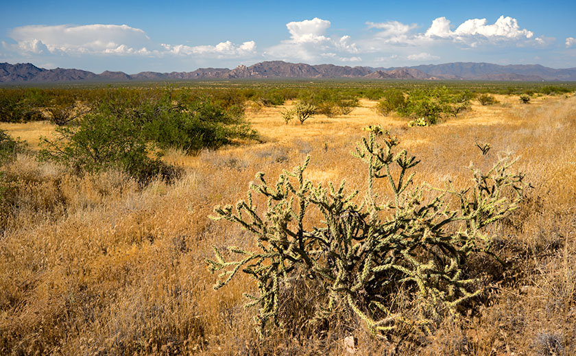
This long-term project started off after returning from the Alaska excursion. On that trip, I started posting landscape photos using a ratio of 16:9. That’s the wide format commonly used in HDTV. The photos fit the blog slots and I liked the way they looked, so I decided to keep the ratio as my landscape standard. To display them effectively on the web site, I wanted to give them more room and that meant putting them on a wider background. Since I was changing that, I opened up the left side menu which complies with Google’s new “Hand-held device policy”. That will make it easier for a phone visitor to touch a single menu item. Finally, since I have this new-found space, I decided to make all the images and thumbnails larger. Since that means revising several hundred pages. The task will keep me off the streets and out of bars for a while.
Deciding where to start was easy, I began on the New Work index page. I hadn’t cleaned up this page for a while and a lot of images were taken several years ago. I can’t consider them new any longer, so I’m moving them into the Ongoing Projects pages if I still like them, or getting rid of the ones that don’t work for me any longer.
I’ve also created a new project page for my West Side work. It’s not officially up yet, but you can get a sneak peek by going to http://www.jimwitkowski.com/westSide. Since I had to start fresh, you can get a good idea of what the finished page will look like. I think it’s less crowded and a cleaner look.
When I first created this Web Site, I used small images to reduce the bandwidth. After all, most people used dial-up then. With high-speed connections and bigger monitors, bandwidth has become more generous and I can afford to post larger, reasonably formatted images. As an example of the changes I’m talking about, compare these pages:
- http://www.jimwitkowski.com/Arizona/mtOrdAgaves.html This one has the original formatting with the cutesy simulated mat opening designed to give you an idea of how a print would look in a frame. The image is almost lost on the larger background.
- http://www.jimwitkowski.com/Arizona/weltonMustard.html This is a standard 4:3 ratio landscape image in the larger size. The viewer can see much more of the detail in the photograph.
- http://www.jimwitkowski.com/newWork/kluaneRuby.html In this example, the image is the wider 16:9 ratio which makes the landscape more expansive (you need a large copy for over your couch right?). The image is an inch wider than in example 2, but it’s still not crowded on the page.
As I said, there are a lot of pages that need revision so progress will be slow but steady. Since I have this blog tool, I will be using it to announce my progress. However, I’m also going to take advantage of the tool to make posts about other crazy ideas that run through my mind. The topics will photography centered but there’s no telling where my mind will wander. If you’d like notification when I post a new rambling, use the “Comment” link in the left column and check the “Notify me of new posts by email” box in the comment section. Please feel welcome to add your two cents as well. You’ll need to give an email address of course, but that’s a small price for so much joy (email addresses are not published anywhere on this site).
Till next time
jw

