Thanks for joining us for this, our last photo and story from our visit to San Luis Obispo County. Throughout our journey, we’ve discovered many subjects to photograph in this beautiful part of California, even when our schedules are filled with other activities. And that brings us to this week’s image.
You see, I have always been attracted to old white buildings. Perhaps it started during my early years of working with black and white, where these structures had an uncanny ability to pop against a dark background in prints. This allure has carried over into my color photography. Whenever I stumble upon a weathered white relic standing proudly in the fields, I feel compelled to stop my truck and capture its essence.
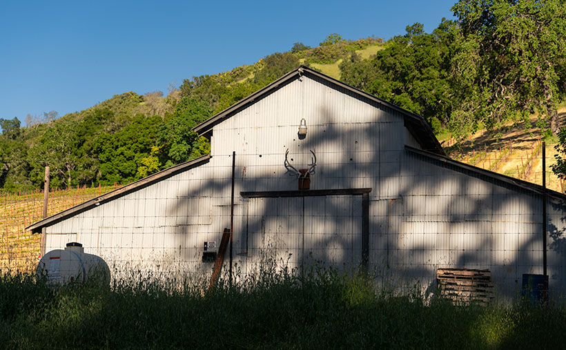
One such encounter occurred during our visit to the Adelaide Wine District in Paso Robles. As Queen Anne and I hurried along a narrow back road en route to our vineyard appointments, we inadvertently passed by a charming white barn. In that fleeting moment, I instinctively exclaimed to Anne, ‘I got to get me a picture of that barn.’
We found ourselves racing east, west, and back again past the white landmark three times, like in a Road Runner cartoon scene. Imagine those exact words hanging in the trail of dust left behind us. After our final tasting, we allowed ourselves to leisurely return to the barn to capture its portrait through my lens.
Something is enchanting about these old white buildings. Their weathered facades, the stories etched into their walls, and the unique character they bring to the landscape captivates me. In the case of this barn, the quality of light, the interplay of shadows, the closed doors, and its tidy upkeep evoked a sense of tranquility and a conclusion to a day of hard work.
In this particular example, which I refer to as Shades of Solitude, I was fortunate that circumstances prevented me from stopping at the barn earlier. Those extra hours before I returned allowed the sun to descend toward the horizon, casting a warm and inviting glow upon the scene. The timing of the sun’s position enhanced the barn’s features, accentuating the corrugated texture of its weathered exterior.
One of the delightful surprises that unfolded due to the lower sun was the presence of a tree that partially blocked the sun. This seemingly obstructive element turned out to be a blessing in disguise. The sun’s rays filtered through the branches and leaves, creating an interplay of light and shadow. Those soft, dappled shadows on the barn’s facade added depth, dimension, and a touch of mystery to the composition.
In the presence of the barn, time slowed down, allowing me to appreciate the peace that enveloped the scene entirely. The absence of noisy tractors, the distant hum of traffic, and the clamor of the everyday hustle and bustle created a sanctuary of tranquility.
You have a couple of options to view a larger version of Shades of Solitude. Visit its dedicated webpage by clicking this link: (Webpage link: Shades of Solitude). For a more detailed image examination, head to my posting on Fine Art America: (FAA link: https://fineartamerica.com/featured/shades-of-solitude-jim-witkowski.html). On the Fine Art America page, if you hover over the image, you’ll see a green square; clicking inside the enclosure will grant you a one-to-one preview, allowing you to explore the intricate details of the photograph—an indulgence we photographers often call “pixel-peeping.”
We are delighted you joined us on this journey to Shades of Solitude and hope you find comfort in its tranquility. As we conclude our trip through Shades of Solitude, we extend our heartfelt gratitude for joining us in exploring quiet beauty and tranquil moments. May this image serve as a gentle reminder to seek solace in the peaceful corners of our world and to appreciate the moments of stillness that bring a sense of calm to our busy lives. Please join us again next week when we return to the Sonoran Desert to explore some familiar Phoenix landscapes.
Till next time
jw
Techniques: Seeing and Using Contrast to Enhance Your Photographs
Mastering contrast is critical to creating captivating and visually striking photographs. Contrast is the difference between light and dark tones, colors, textures, or subjects within an image. By understanding how to see and utilize contrast effectively, you can elevate the impact of your photographs and create images that truly stand out.
Emphasize Light and Dark: Achieve contrast by incorporating substantial variations between light and dark areas in your composition. Seek scenes with bright highlights and deep shadows, and consider how these contrasting elements can add drama and depth to your photographs. Pay attention to the direction and quality of light to create compelling contrasts that enhance the visual impact of your subject.
The contrast in Colors: Leverage the inherent qualities of colors to create visually striking images. Explore complementary colors, such as blue and orange or red and green, to generate vibrant contrasts that command attention. Experiment with warm and cool tones to add visual interest and create a sense of depth in your photographs.
Textural Contrast: Texture plays a significant role in photography. Incorporate contrasting textures like rough versus smooth, soft versus complex, or matte versus glossy to add visual intrigue and tactile depth to your images. Consider how these differences can create a captivating interplay within your composition.
The contrast in Subjects: Create contrast by incorporating diverse subjects within your frame. Experiment with combining elements with distinct characteristics or qualities, such as organic shapes against geometric structures, nature against artificial objects, or a minor subject against a vast landscape. The juxtaposition of contrasting subjects can create visual tension and enhance the overall impact of your photographs.
By developing a keen eye for contrast and understanding how to use it effectively, you can elevate the storytelling potential of your photographs and create images that leave a lasting impression on your audience.

