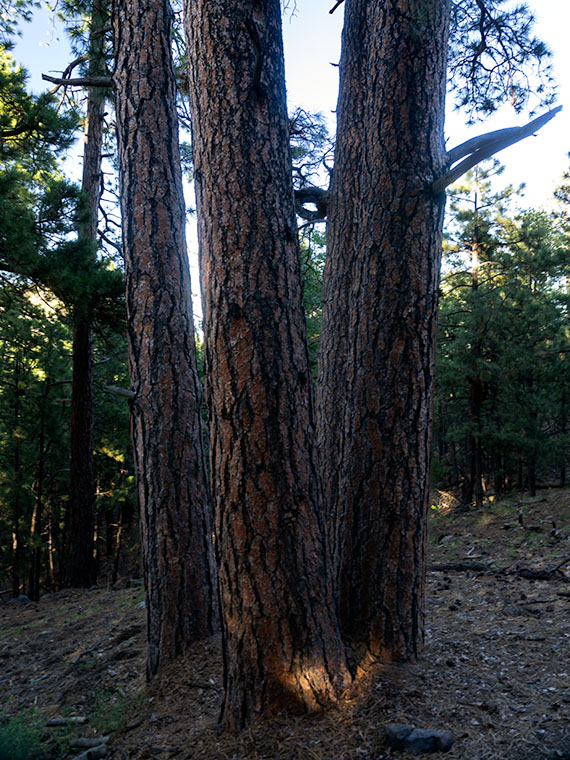
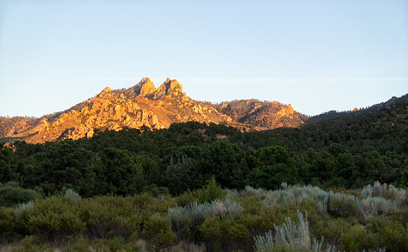
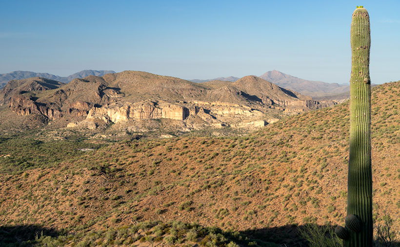
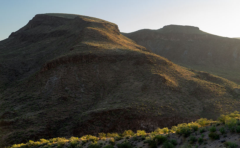
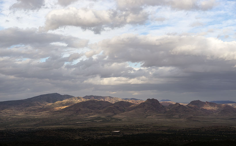
I spent all day making this Christmas Card for you.
Until next time … jw
I spent all day making this Christmas Card for you.
Until next time … jw
One good thing about photography as an art is that you don’t have to lug around a truck-load of equipment. You don’t need easels, dozens of brushes, tubes of paint, and canvases. All you need is to show up with a camera and some light. That’s an important enough concept for me to repeat myself. There are four variables in photography: the photographer, the subject, the camera, and the light.
If photography is that simple, then why are some people so much better at it? As I’ve previously said, most people assume it’s the camera, which I’ve already discounted. “It must be the subjects then,” you’d suggest. My answer to that would be that you could open Google and search for photos of Delicate Arch (Arches National Park Utah). There are hundreds of photos of the iconic arch, but some stand out from the crowd. Of the two remaining variables, I think that learning to understand lighting is the more important. “But, light is light,” you protest. “Au contraire, mon ami,” I answer. You say that because you haven’t bothered to notice.
When I took classes at Art Center College of Design, the school felt that lighting is so important to photography that the first two exercises we had to complete involved lighting. In the first, we had to make shapes—a ball, a cone, and a cylinder—out of white paper. Then we photographed those shapes before a white background of the same paper. The point of the exercise was to teach us how to separate the foreground from the backdrop using light. The other assignment was to recreate the studio lighting from a ‘40s movie studio still-shot. Instructors assigned us a photograph that we were to analyze, then set up the lights and shoot our model using a single-, two-, or three-light set-up. “Well, that’s all good in the studio, but you don’t get to do that out in the wilderness,” you say. And I’d repeat my French answer. If you want to improve your photography, you need to understand how light works. True, the sun isn’t on a light stand that you can just move around, but you can learn when the light will be better so you can tell your story—even if it means having to wait for it.
There are two types of light sources; a point source and diffuse source. In a studio, a point source is a spotlight. It throws off a narrow beam of light creating dramatic highlights and shadows (high contrast) and it’s often called a key light. Sometimes the dark shadows are softened with asecond—less intense—light called a fill light. Outdoors, the spotlight’s equivalent is the sun, moon, or a single street lamp. On the other hand, a diffuse light is broad and even; like a fluorescent light, a window without direct sunlight, or even a spotlight with a semi-opaque cover (a diffuser). The light is softer and the shadows are not as harsh. In landscape photography, you get diffuse light on a cloudy day, in a building’s shady side, or at dusk and dawn.
With any light source, its angle to the subject makes a difference too. If the light is directly behind the camera, it will flatten details, while a sidelight emphasizes textures. A light behind a subject—called a backlight—will emphasize feathery edges—like hair or grasses—giving a halo effect. Finally, an overhead light is just another side light from a different direction. Each of the lighting directions—and combinations of them—will show off different qualities of your subject. As a photographer, it’s up to you to choose the light angle that tells your story best.
Finally, the third aspect of light that is important is color. Part of a stage director’s arsenal is changing the color of lights to set the tone or mood in a play. People who aren’t aware of small color variations, see light as always being the same because our brains compensate for it. I remember the “Stone Age” of photography, blue flashbulbs, and questions like, “Why are my party pictures so yellow?” It’s because the color of light is different between a tungsten light bulb and the sun and those color differences are measurable in degrees of heat, not in Fahrenheit or Celsius, but Kelvin—a much broader scale of temperature used by astronomers. The light bulb burns at only 3000° K, while the sun burns at 5778° K. Another tidbit about the sun is that it’s not yellow—it’s white. It’s always been white for as long as man’s been on earth. Although doing so wouldn’t be very smart, if you looked directly at the noon sun, you’d see white. Only when the sun’s rays travel through extra miles of atmosphere do they seem redder. With digital cameras, this is the topic of White Balance, a discussion I’ll save for later when we talk about cameras. For now, let’s just say that warmer colors seem romantic (sunsets and candlelight) while the bright white or bluish appear cold (icebergs and igloos).
Light attributes that we’ve discussed here combine to create something ethereal called light value. The light’s intensity, its angle, and its color are the things that successful photographers understand and use to improve their images. They show off their subject in the best light (sorry, I couldn’t resist). So, what is photography’s best light? All of them I’m afraid. It’s like asking what color or brush makes the best painting. All the light values are in your toolbox for you to use, and you must search which best suits the story you’re telling. Don’t get stuck using only one, experiment and learn what works best for you and for the style you’re developing.
Until next time … jw
It was nearly a century ago that Fred R. Barnard coined the phrase, “People say a picture is worth a thousand words.” I wonder if that statement is always true. Sometimes I look at photographs and they speak volumes, while others are silent. You may look at the same body of work and feel differently. That’s because we have different backgrounds, values, and tastes. We’re all unique. My point is that photographs, paintings, and art, in general, are a type of communication. They connect the artist with the viewer—sometimes across eons. We save art important to us on our refrigerators and in our museums because we like what they say.
There are no language-like rules to help us understand this type of communication; it’s up to personal interpretation. Some messages are simple while others are cryptic. They may sooth or repulse the viewer. With most photographs—or snapshots at least—the story is simple, “At some time, I was here and this is what I saw.” There are millions of photographs just like that posted online and they have little interest to anyone but the person who pushed the camera’s button. When I was in a Pasadena City College class—more than a half-century ago—my professor called them Record Shots. They were a simple record of time and, on the spectrum of art, they belonged in the big pile on the left. On the opposite end of that imaginary line is a short stack of Masterpieces, and everything else fits in between. What separates the two extremes is how good the story is and how well it’s told.
An artist’s job is to see a good subject and be able to skillfully capture it on a medium, photographers included. There are skills to help you along, but none are more important than thinking about what you’re shooting. I can plead guilty to mindless shooting, and I don’t know any photographer that isn’t also guilty. Unlike paintings, we create photographs in less than a second. We can squeeze the button and then walk away, never giving it a second thought. But when we look at the contact sheet or RAW image on the screen, we often ask, “What was I thinking?” The answer is, “I wasn’t.”
The idea that I’ve been leading up to is this: To move your work closer to the right-hand stack, begin to think about what you’re shooting. There is something in front of you that has caught your eye and it’s moved you enough to raise your camera and snap the shutter. Fine, go ahead. Maybe you’ll beat the Powerball odds and have one of those remarkable snaps that make the evening news. Odds are against you. But if you stop and think about your subject, you will improve your chances of capturing that lucky shot. What stopped you? Why did it make you stop? Think: “Is there something I can do to make the shot better?” Very few people shoot film any longer and certainly, you can afford to waste a few million electrons on extra frames. Here are some questions I have on my mental checklist:
To paraphrase a line that we saw on Mr. Robot last night. In the show, they were talking about the game of chess, but it works for photography as well. “If you see a good shot, look for a better one.” You’re probably thinking, “Great! Now I have to hang around for days for that to happen.” If you’re on assignment for National Geographic, you bet you do. That’s what you’re paid to do but unfortunately, neither of us works for them. Most of the time, what I’m saying takes an extra minute or two and, with practice, it eventually becomes second nature. With experience, you even save time because you don’t learn to omit the record shot.
Finally, I have a hard and fast rule: When you’re back at your desk, instead of a bunch of snapshots, you will have a photo series. Some better than the others. When you edit them, be ruthless and pick out the very best then get rid of the rest. If you can’t do that, keep them to yourself. Never show them to anyone. Only show your best. Of course, if you have an editor or art director that will be their job and you won’t have a choice. Then again, if you had an editor, you wouldn’t be reading this.
Until next time – jw
I’m a visual person. I learn quicker from one YouTube video than reading a stack of manuals. I like looking at pictures whether they’re drawings, paintings, or photographs. I look for several aspects of images; the locations, light quality, and creativity. As a photographer, I get inspiration from seeing other people’s work. I try to understand what the artist saw and learn, so I can blend those ideas into my work. As you would guess, a lot of frogs get tossed back in the water before a princess appears.
At times, when people find out that I’m a so-called photography expert, they’ll pull me aside to ask for my advice about cameras or shooting. I’m not a big equipment techie as I think most cameras are more capable than their users are, so when they ask me which body to buy, I just usually steer them to the brand they want. I really believe that newbies get more from learning technique first. Those skills transfer across camera brands. If my coaching is successful, the next thing that usually happens is that they treat me to a pile of their vacation photos (vacation, kids, pets, goats, etc. are all interchangeable here).
As I look through their image stack, I have so many suggestions that it’s hard to know where to start. A common thing I notice is subject placement, or more specifically, consistently centering the subject. It tells me that instead of composing, they’re aiming. I sometimes get in trouble when my stupid mouth automatically blurts, “Well, if you were using a gun, you would have killed (him, her, it).” As an example, I found an image on Flicker’s Public Commons section titled Christy Mahon on the Telephone. In spite of what I just said, I like this image; it works regardless of what I’m talking about, so I’ll use it to illustrate my point. As you can see from my markings, the poor ol’ railway signalman would have “taken-it” in the left nostril. The composition makes me wonder if the photo is a picture of the office or of Christy?
It’s easy to fall into this trap because cameras often have visual clues that trip you. The focus screen below is an example of what I mean. Although the circle is a focusing aid, it acts like the bull’s eye on a rifle scope urging you to center on your target. It’s a common beginner’s trap that photographers quickly learn to avoid.
So, what’s wrong with centering? Well, err … nothing, and if that’s what you want, then have at it. Centering is actually how we see. We go through life looking at a series of scenes on which our eyes stop for an instant before moving to the next. Our brain processes the information so fast that it seems to flow—like in a movie. We focus using our vision’s center, while our peripheral vision is fuzzy—out of focus. If we detect movement in the corner of our eye, our eyes instantly flick in that direction. For self-preservation, we need to know what was moving. If the movement’s not a threat, then all’s well and we relax. The brain is constantly centering the world around us. If a subject is centered and balanced in an image, we experience calm before we move on … or take a nap.
Now, if we move the subject off-center, our brain tries to restore equilibrium. In this micro-struggle we sense tension and that creates a wee bit of emotion. Remember back to your Psych 101 class when you learned that people remember things more intensely when there’s an emotional attachment. You want your viewers to stop in their tracks when looking at your work and that’s why artists have learned to intentionally use this tension in their work for centuries.
The point that I’m making is that the center of your viewfinder, screen, pad, paper, canvas, or whatever is unimportant. Instead, concentrate on how your subject relates to the edges or frame. Stop aiming and think about composing within that frame. Train yourself to scan the entire area and become aware of what you’re including in your composition. Equally important, is knowing what to leave out. Where are you placing your subject? Where is the horizon (if there is one)?
A question often asked at this point in this discussion is, “Where should my subject be if not centered?” Fortunately, it’s not a secret. Leonardo Da Vinci, Rembrandt, O’Keefe, et Al., used this technique. The ‘feel good’ spot is around the one-third mark, and recent scientific studies seem to confirm its validity (a topic I’ll save for another discussion). An accepted guideline is to divide your canvas into thirds—in a tick-tack-toe pattern. Where those lines intersect, are your composition’s power points and the most effective place for your subject. X marks the spot if you will.
Returning to the example photograph of Christy, I have two versions of the image cropped using the so-called Rule of Thirds; one horizontal and the other vertical. Look at the versions and see what you think. Each revision has the same two players; Christy and the depot. For you, how does the story change between the editions?
In this post, we’ve discussed the camera’s viewfinder. Every camera has one and often it’s misused to aim the lens at the subject. I argue that it is a more powerful tool when used to compose your image as intended. A first step in seeing a photograph is intentionally placing your subject for the best impact on the story you’re telling. By choosing where to frame your subject, you’re beginning to see like a photographer. I know, the process seems cumbersome and tedious, but you wouldn’t still be here if you weren’t willing to try. I assure you that with practice, this skill becomes ingrained and you’ll stop thinking about it.
Until next time … jw
Shortly after moving to Congress, I joined the Wickenburg Art Club (WAC) or more specifically, the Photo Group of WAC. I joined for multiple reasons. Being new to the area, I wanted to meet like-minded people and I felt that being a club member would open doors to show my work. Joining met both of my expectations, but now there’s a price to pay. When you tap into the benefits of any organization, you’re also expected to contribute and, in my case, I’ve been “volunteered” as a committee member whose mission is to organize a half-dozen photography seminar. The goal is to share our experiences with members looking for help. They’re essentially photography classes taught by journeymen.
I spent a small part of my technology career as an adjunct faculty member teaching community college computer classes; including Adobe’s Photoshop. In a structured education system like that, students start with a history lesson where they’re taught about Atget, Stieglitz, Weston, et al. but we’re going to blow that off. Instead, I think we should start with a fundamental that transcends all cameras. It’s a skill that every photographer struggles with and few (including myself) ever truly master—the skill of seeing. It’s not a binary thing where you either got it or you don’t, but a continuum. We’re all somewhere on that spectrum and some of us sweat to improve.
At art shows, an occasional customer will comment while rifling through my bins, “Wow! You must have a fabulous camera.” Although I assume that they appreciate my work, it could be construed as an insult. It’s like saying Alton Brown is a great chef because of his pots and pans, or Renoir had magnificent brushes (not that I put myself at that level). The fact is that I do have a couple of good camera systems, but they’re just tools. On their own, they won’t make me a master photographer.
A camera is a key tool in photography, but you can make good pictures without spending a fortune on fancy cameras. For example, look at the fabulous work being done with smartphones. To be a good (on the way to great) photographer, there is an app that’s even more important than a camera. It weighs about three pounds and you need to lug it around all the time. I know it sounds cumbersome, but you already do. The app lives at the back of your eyes between your ears—it’s your brain. OK, maybe that’s the hardware part which is a state-of-the-art processor. My point is that you need to train yourself to see like a photographer. It takes practice, but like they say about Carnegie Hall, “Take the subway.”
For these seminars, I’ve gathered some thoughts on how to start your journey. There are too many for a venue like this blog, it’s more suited for a book, and I’m too lazy to write one of those. In my upcoming posts, I’m going to take each idea in turn and write about it. That way you can take a break in between and think or practice what we’ve discussed—in the grown-up world they call that method distributed learning. After that, I’ll get into camera techniques and explain what the buttons do—and why. Instead of a lecture, I’d like a discussion knowing that some of you are more advanced on these topics, so I ask you to chime in. Ready or not …
Till then … jw
Have you ever noticed something good but didn’t want to spoil it by talking about it? That’s been the past couple of weeks for me. Now I think it’s safe to say that summer’s finally over! The temperature hasn’t broken the century mark in Phoenix for almost a month and in Congress, it hasn’t cracked 80° for the last week. I’ve even broken out a light sweater to ward off the morning chill—relief at last.
Much like spring, the Sonoran Desert autumns only last a couple of weeks before winter sets in. Of course, our winters pass for other people’s summers. We have nice sunny days, but you may need a jacket now and then. It just rains more often. We don’t get fall color like they do in Flagstaff, the cactus stays green. The only plant that takes fall seriously around here is the desert broom which flowers and releases clouds of feathery seeds that cover everything in sight. It’s as if your dryer vent went berserk and spewed lint over the neighborhood. Unlike the leaves in Vermont, it’s not a cherished sight that tourists flock to see.
It’s that time of year when we clean and put away our travel gear. We don’t go abroad now. Instead, the rest of the world comes and lives with us. It’s the beginning of the annual snowbird migration. Locals are busy planning shows, galas and festivals to entertain them … and to help separate them from that last quarter in their pocket. We work hard at it and save up all the money we take in so that next summer we can afford to travel and get fleeced by someone else.
It’s also time to shift away from last year’s travel stories and photographs and begin to plan our trips for next summer. In the coming months, I’ll don my velvet jacket and sit by the fire, pipe in hand, scouring camera catalogs and studying how-to videos to improve my photography. It’s an endless journey.
At the same time, I committed to helping my local photography club host weekly photography seminars. A few of us are putting together a syllabus so that we can share our experiences with newbies. We’re planning to start these sessions after New Years and we’re gathering material for our presentations.
I think that some of this stuff may interest you too. How do you feel about being a ‘beta-tester’? As my thoughts congeal into coherent ideas, I want to post them here. My hope is that you can give me feedback like: was the idea clear, was it too technical, did it help or was too basic—or too advanced? Perhaps you already have a photo questions that you’d like to ask. You can ask a free-range of topics (Just don’t ask about the velocity of a fully ladden swallow). Do you want to know about cameras, improving your pictures, making frames, or putting your work on the Web? If you ask, I’ll try to get you an answer even if it’s from someone else.
I’m also open to having guest experts write articles. If you’re familiar with a camera or a technique, I invite you to share your knowledge with us. There is so much to learn about photography, it’s impossible for one person to know all of it. My plan is to start simple and try to disentangle the complex.
I’m excited about collaborating with the club group. I can see that it will take up my free time, but I can also see that these sessions will be helpful and rewarding. Isn’t that what retirement is for? I hope that you’ll join in on our experiment.
Till then … jw
I’ve been neglecting my social media for a couple of weeks because I was busy in the shop making my entry for the Worlds-Most-Expensive-Shelf contest. It took me a little over a week to make it—which is fast by my standards, and I installed in the closet yesterday. I didn’t make it expensive on purpose. My pocketbook just suffers because of my cabinetry skills.
I made the shelf to hold my Keith Monks Record Cleaning Machine. You probably do not know, I’m a fan of vinyl records and I have a substantial collection. Any serious collector knows the advantages of record cleaners and they care for their records by running them through washers. We geeks know that even new records sound better when you wash the mold release from them, and if you depend on the used market for new vinyl, a cleaning machine is essential.
The Library of Congress uses a Keith Monks for their records and I found mine at an estate sale at a fraction of its original price. I’ve had it in three houses now but I’ve never had a proper place for it. Our shack in Congress has an ideal spot. The previous owners replaced the original air conditioner with a version that sits on an outside slab. That left the utility closet next to the stereo empty, so I claimed it before Anne converted it into another junk drawer. The closet is wide enough for the machine to clear with a half-inch to spare, so I set the machine on the bottom shelf while I thought about the shelf design. After two years, I worked down my honey-do list far enough that I made this project a priority.
It’s possible to machine clean a record while it’s in the closet, but it’s hard to see in the dark—especially in the evenings when I do most of my listening, so my design had to have a slide, and a stout one at that. The thing easily weighs 50 lbs. At our Deer Valley house, I cut a piece of ¾ inch plywood which supported the weight, so I knew the general size I needed.
Last week, I set about measuring and drawing up the plans. I had a sheet of Baltic Birch Plywood and a plank of Cherry hardwood I bought for another project that’s still on the to-do list. There were two pairs of 100 lb slides collecting dust on my workbench. With plans in hand, I grabbed the wood and set out to make some sawdust.
With such a tight fit, I cut the side supports so they would just clear the opening … or so I thought. After mounting the outside rails, they rubbed, so I cut a shim out of scrap quarter-inch plywood to properly space the rails in the opening. After they were in place, I carefully measured the space between them so the drawer would be a perfect fit. I cut the piece of cherry to size and milled box joints on the corners to control the frame size. Then I cut a dado and dropped the plywood into the frame. The width was perfect, but the depth was short. To fix that, I cut another strip of plywood and glued it in place. With that done, my shelf was square and the exact size. All that I needed to complete the project was to sand and finish and sand and finish and sand and finish for the next two days.
On Friday, my shelf was on my assembly table all shiny and pretty and I was proud of how it came out. I carefully measured and installed the rail inserts and took it in the house to slide it in place. It didn’t fit. The rails would insert but they wouldn’t slide in. So I did the most logical thing; I got a bigger hammer. With a lot of pounding it went into place and now it wouldn’t come out. “Maybe the shelf is too wide,” so I sanded the sided with very coarse sandpaper. I gave up after a while and left it till morning.
Starting fresh on Saturday, I shaved each side .05 inches. The slides inserted but they’d stop with a clunk, so I looked closely at them and I saw that during my bout with the big hammer, I had damaged them. They were bent and some ball bearings had come out of their races. Then I saw that the right side was not parallel; when I put the ¼ inch shim in, I misaligned the track so it was binding.
After installing the second pair, the rails worked smoothly, but now the shelf was too narrow from all the trimming. Now I had to take the rails off again and use shims to space them correctly. It was late morning before I slid the shelf in place and worked it in and out. For a millisecond I thought about pulling it apart to finish the sides, but I decided to save that for another year when I get a round-two-it. I’m looking forward to next Friday’s music session when I get to relax while listening to clean records.
Till then … jw